Showing posts with label Layout. Show all posts

Dandelion Wishes Scrapbook Layout


Hello friends. Yesterday I shared about my conversion to Stampin' Up! I shared cards made with the cute, cute, cute Dandelion Wishes stamp set. I also mentioned that this stamp set is also perfect for scrapbook layouts.

The layout above was created very quickly late last night and is not representative of my best scrapbooking. It does, however, illustrate how nicely this stamp set works on a scrapbook layout.

I downloaded three photos from Google Images (I call this child part of my fake family). After printing the photos to a standard 4"x6" size, I used my paper trimmer and cut the photos down to 4"x3.75". I matted the photos onto a 4.75" by 11 piece of white cardstock. I then matted the white cardstock onto a 6.5" x 12" piece of print cardstock. I cut 1/2" x 6" strips of designer series cardstock and affixed the strips as trim on the page.

I used my circle die set and cut out a stamped image of the dandelions and using the same designer paper, I cut a scalloped circle mat.

I used Memento black into to stamp my images and Pool Party Ink to color the dandelions.

This layout was so easy and quick, but it is still cute. With a little personalized journaling, this page would be book ready!


Products Used:

Dandelion Wishes 146747
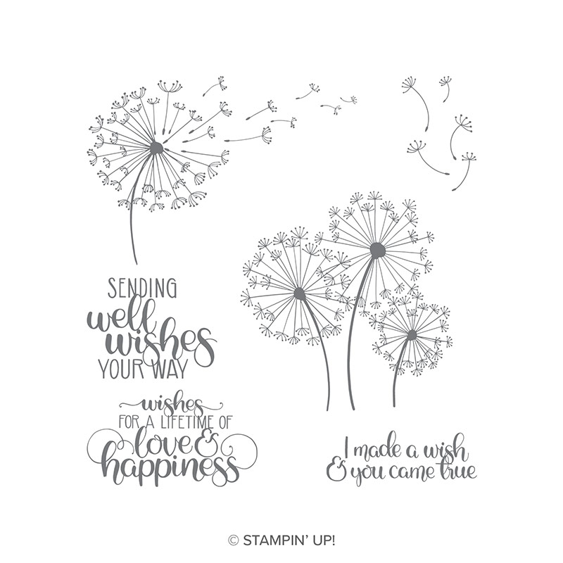
dandelion wish stamps


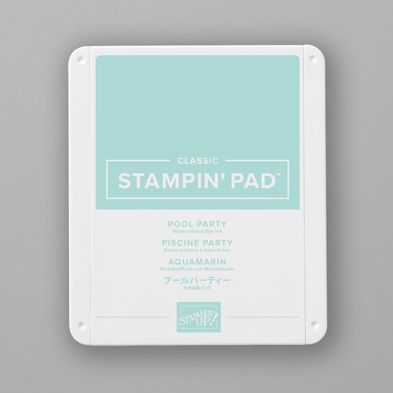
Pool Party Ink Pad 147107

pale blue ink pad


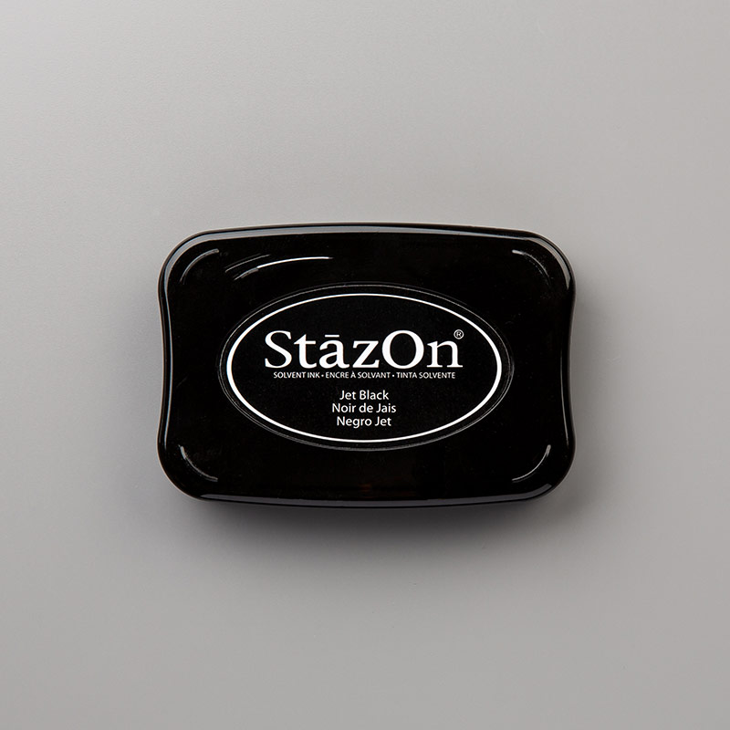
Pool Party Ink Pad 101406

black ink pad


Layering Circle Framelets Dies 141705
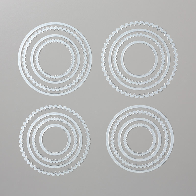
layering circle dies


Whisper White 12 x 12 Cardstock 124302
soft white paper


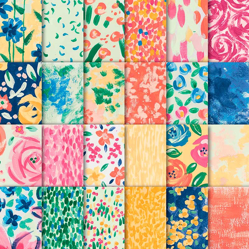
Garden Impression 6 x 6 Designer Series Paper 146289
colorful floral paper


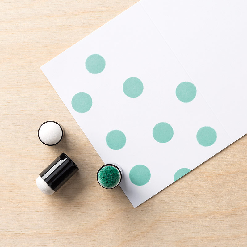
Sponge Daubers 133773

sponge dauber

Lil Tree Hugger


Hello friends.  Happy Spring Break to my Aiken Peeps.  At Bitten By the Bug 2 this week we are celebrating Arbor Day.  Our Design Team sister Kelly chose this challenge. In honor of Arbor Day, later this month, we were to include a tree on this week's project. 

I knew exactly what photos to use when I saw our weekly challenge! I have had these two photographs of Avaleigh since last fall. I just love both photos and had been planning to scrapbook them.  This challenge helped to get me motivated to design the single scrapbook page above. 

I love that Avaleigh is watering a tree, as well as hugging a larger tree as she contemplates life.  The title of the layout, Lil Tree Hugger, came both from the photo and from the nickname for ecology minded individuals. Perfect for our sweet little helper. 


I used four Cricut cartridges on this layout:

The flowers were cut from Live Simply.  I did make some edits on the leaves on the bottom flower.


The watering can was cut from Walk in my Garden. I added words and dots to the can.

The tree was cut from C.M. Stork's Delivery.  I used the slice feature in Design Space to use only a portion of the tree.  I also welded a very narrow rectangle to the trunk to extend the length.

The fun leafy border in the middle of the page was cut from M.S. Birthday Cake Art.  There are a lot of cute borders on the cake cartridges!

The font I used is called Naira.  I had the Cricut write the words onto the cardstock by using the font and "attach" feature in Design Space.  I then used watercolor pens to color in the letters.  I especially like the way the letters look on the pink print layer.


Recently I made a discovery in Design Space, which made me feel - to borrow from Will Smith in IRobot - "like the dumbest dumb person ever."  I had NO idea that there was a tool in Design Space that identified the cut and cartridge of each image placed on the virtual mat!

I was checking the color of the watering can and on impulse I clicked the i at the tops of the color layer attributes menu.  Much to my surprise, a message popped down identifying not only the cut, but the cartridge!  I had been asking for this feature FOREVER.  I now wonder if it has been there all along and I was the "dumbest dumb person" who never before clicked on the i?  


Hoping that I am not the only person who had to search images all over again once their design was complete in order to identify the cartridges they used, I decided to share my find.  Below is a close up of the drop down menu. Please no laughing and finger pointing from those who already knew this.  Sigh....


I completed my layout with white pen doodles and dots on the flowers and the tree.  I also added adorable sequins to two background areas.  And even though the layout is busy, I feel like the photos of Avaleigh are still the focus.


Thank you for stopping by today.  I do hope you plan to go by the Bitten By The Bug 2 blog today.  Our team came up with so many cute variations of the Arbor Day theme.  They are sure to inspire you to create your own Tree themed project!

Cute Baby Jude Layout


Hello friends. Welcome to this week's Bitten By the Bug 2 challenge - Cute as a Button Baby challenge.  One of the other new grandmothers, Maureen, chose this week's challenge. I discovered a stash of completed layouts stacked together and realized that I had never shared any of them on my blog.  And as luck would have it, among them was this darling layout of one day old baby Jude.

I used three Cricut cartridges on these two pages:  Baby Steps, Disney Mickey Font, and 3 Birds on Parade.  


I found this cute little new delivery baby on the 3 Birds on Parade.  I removed the bird and suspended the bird from my Hey Jude title.

The sweet baby sleeping on the moon is from the Baby Steps cartridge. This is a go to cartridges on all things baby related.

The phrase OH BOY was cut using the Mickey Font Cartridge.  

The Beatles cut below is an SVG file I made using a cartoon image from the Internet.  I used this same SVG cut in iron-on material and made Jude an adorable gown and cap set.


If you have not already been by Bitten By the Bug 2 blog today, please do visit.  The design team has created ADORABLE baby projects.  You will love them.  Also, we would love to have you join our challenge this week.  If you have baby photos to scrap, or a new baby card to make, this is your chance!

Thank you so much for stopping by today.  I do have additional layouts that I plan to share later in the week. 


First Bike Birthday Party Layout


Hello friends. I am back with a surprise part two of Monday's post - Avaleigh's birthday party.  I scrapped a total of four pages on Avaleigh's second birthday party.  The first two pages where shared on Monday as my Bitten By the Bug 2 birthday themed project.  Today I have two additional pages.  The first page features the Schwinn Roadster Tricycle that "GranDoug" and I gave to Avaleigh as a birthday present.  The second page is Avaleigh and her parents celebrating. 

Let's begin with the Cricut details. I used two cartridges on these pages: The fun double layer font is from the Carousel cartridge, and the tricycle is from B is for Boy.  I made edits to each of the cuts. 1. I removed the open diamond shape from the top layer of the letters.  2. I cut the bottom layer of the bike twice - once in black and again in silver grey.  I then snipped apart the silver layer and assembled to make the bike more closely resemble Avaleigh's bike. 


As you can see in the photo progression above, Avaleigh loved her bike. Her cute cousin was the first to comment on her bike.  When we brought it in, Seeley shouted, "COOL!"

I used the same paper for these two pages as I used on the first two pages.  I also used the cardstock stickers "YOU ARE Sweet" on the last page.


First Swimming Adventure


Hello everyone, welcome to this week's Bitten By the Bug 2 challenge.  My wonderful Design Team sister, Sharon, selected this week's Cricut Challenge cut theme.  Sharon asked us to create a project about swimming or water.   I had just downloaded the photos of Avaleigh's first swimming pool adventure at her Aunt Christy and Uncle Josh's house.  She was not sure about the pool at first, but she really got in the spirit of water play after a bit.  


I am not going to lie, I used cuts from a lot of different cartridges.  Seriously, I used cuts from nine different cartridges on this one layout.  I used Once Upon a Princess to create that adorable mermaid, Animal Kingdom to create the kissing fish, Splish Splash to create a fish, Create a Critter to create the Starfish, Animal Antics to create the Snorkeling Fish, Doodlecharms to create the Sea Horse, Paper Dolls for Everyday to create the ocean floor, Life is a Beach to create the Seaweed.


I finished the layout with tiny air bubbles, assorted pink, champagne, and brown gems on the ocean floor as well as a sand (champagne) colored ribbon under the seaweed.  


I am pleased to say that there were no big events in our lives this week.  No one eloped, no one lost or found a new job, and everyone had a nice week!  I am planning a Vegas themed reception/party for Aaron and Crissie, but I do not plan to go as over the top as I have been know to when party planning. 

Thanks for stopping by today.  I do hope that you take the time to go by Bitten By the Bug 2 and see the amazing projects my design team sisters made for this week! They are so talented!!  Also, we do hope that you will join us in the swimming/water challenge this week!


A Poorly Photographed Layout and a Baby Update


Hello everyone.  Today I am going to share another poorly photographed wedding layout with you AND give you an update on my overdue granddaughter. 

Bethany was admitted to the hospital last night, given medication and was hooked up for monitoring. Avaleigh is being a stubborn girl and just does not want to meet us!  However, Bethany's doctor says enough is enough - today is the day!  This morning Bethany will be reevaluated and most likely will receive a Pitocin drip to start labor.  If nothing develops and there is not marked progress, Avaleigh will be delivered via c-section today.  The odds are against them for a natural delivery. The doctor said that 80% of women in Bethany's circumstances (lack of dilation, etc.) end up with a section. Bethany seems to be taking this all in stride, though she and John did call and talk to us last night. But then again that was probably to settle down Doug and I!!!  If all goes well I just might have baby photos to post tomorrow!


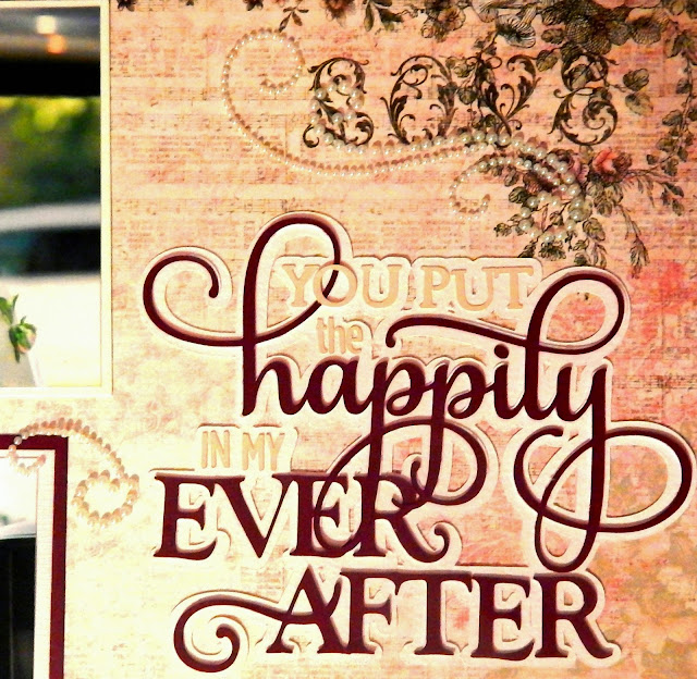
Now to paper crafting - this two page layout - again POORLY photographed - was created using printed card stock with solids.  I love, love the sentiment - You put the Happily in my Ever After.  I found this cut and the Mr. & Mrs. cut in the Silhouette America store.  


I used a lot of pearls to embellish this layout.

I hate that the photos are so dark, blurred, glarey, etc.  The layout really is darling when one can actually see it!


Thanks for stopping by today and be sure to check back tomorrow to see if we have baby news!!


Details Wedding Layout


Hello everyone.  Do you remember the old saying, "The Devil's in the details"?  I do not believe that.  I believe the finished look is in the details.  And that is what this layout is all about - the look of Bethany's wedding created with the details.

First, I MUST apologize for the color issues I have had with the last two layouts. Neither Monday's layout nor today's layout photographed true to color.  The colors are much better in real life.


I was a very fortunate mother of the bride in that my daughter had a vision of what she wanted for her wedding AND it was a look that I loved and had no trouble embracing and growing.


With this layout I feared any scrapping elements might over shadow the actual photos so I went with a simple layout:  I cut my printed 12 x 12 inch sheets of  card stock down to 10.5 x 10.5 inches and matting them onto Colonial White card stock. Using my Silhouette Cameo, I cut six double layer roses and two corner vines.


I assembled four of the roses the correct way, and for the other two I applied the negative area of the petal cutouts to the background rose.  I wanted to create a bit of contrast when I layered the flowers on the pages.


I cut the vine in a subtle cashmere color to enhance the pages, but not over take them.  I am very pleased with how the pages turned out, even if the photos do not reflect the true colors and details.


Please forgive any errors in this post - I am sure I missed many.  We like to honor the true 12 days of Christmas at our house so yesterday was Christmas decor de-decorating day where everything was taken down and put away - almost.  My Dickens Village is still out  and I must sort through bows and tags to see what is salvageable.  Yesterday was also my mom's 78th birthday so in addition to the Christmas deconstruction, I also hosted our family for Granny's birthday gathering last night.  It was a LONG day.  THEN I prepared this blog post. 

Thanks for stopping by today.  I will be back in the week more rested with a new post! 


Beautiful Bride Dress Form Layout

 (click the photos to enlarge)

 Hello friends!  I know I have been missing for two weeks(!!) and though I do have an excuse/reason, I will not bore you with the details and just say that I AM BACK!!  I have missed crafting so much - especially scrapbooking. While Doug stayed with my mom, I spent several hours in my scraproom this weekend working on this layout.

My darling Design Team member, Maureen, is hosting this week's Bitten by the Bug 2 Cricut challenge.  Maureen challenged us to use either a Cricut cut DRESS FORM or a Cricut cut DRESS.  I chose to use the dress form cut from the French Manor cartridge - the first Cricut Circle cartridge.


I cut the dress form in two colors - medium brown and champagne.  I wanted the stand to be darker than the form itself. 


Using my Cricut Explore for the Cricut cuts on this layout, I also used Cricut Design space and a font on my computer to cut the page title, Beautiful Bride.  I love that like other bands of cutting machines, the Cricut Explore also cuts fonts and SVG files!  Yay!  I used the font "Lavenderia Study" for the title.


I used several thin dies for cuts on these pages - the corners, a couple of the mats, and the flowers and leaves.   I cut the flowers in vintage white cardstock, stamped the blossoms with  Blush Pink pink ink, then I sponged 3D Stempel Farbe (Stamp Paint - in Rose Metallic) onto the petals.  I used a stylus and rubber mat to shape the flower petal layers.  I glued the layers together then applied a hint of cocoa brown ink to the edges of the petals to age them.


The base paper - I purchased this vintage looking card stock at the Creating Keepsakes Convention specifically to scrap Bethany's vintage wedding.

In the photo above Bethany's maid of honor, Bailey, was finishing up Bethany's make up and hair, placing the vintage hair piece I purchased for her.

In the photos below Bethany is allowing her bridesmaids and I to dress her in her bridal gown.  We were very careful not to smudge her make up or muss her hair!  I had the honor of lacing her in her dress.  Sigh.....


Not having been in my scraproom for some time, I have to say that I LOVED making this layout.  I love all of the lacy cuts and vintage flowers.  I cannot wait to scrap more of the wedding photos.  And I thought that Maureen's challenge - the Dress Form, was perfect for this layout!!

We hope that you decide to join us this week at Bitten by the Bug 2.  Create a project using a Cricut cut Dress or Dress Form, tell us which cartridge you used, then link to the original post at BBTB2.  

Thank you for stopping by today!!!   


Get a Clue - The Beatles with the Revolver in the....


Hey-o everyone.  If you were here earlier and only found photos and no text, that is what happens when your blog owner loads her photos but forgets to go back and finish the post.  I confess that I awoke at 5:00 am and realized that I was going to have a picture only post, but I did not jump up and correct it.

Today's layout - The Beatles - is one that I made LOAD 513 (Layout a day - May, 2013).  The daily prompt was Revolver, as in the revolver card from the Clue game.  Being a huge Beatles fan, my mind went to the Revolver album, hence my title = The Beatles with the Revolver in the (fill in the room).


The Beatles are one band that every member of our family enjoys, probably because the parents have corrupted the children!!  I can honestly say that the Beatles were the first "band" that I was conscience of as a group.


This double page layout is long over due in my scrapping life.  I have not previously scrappedooks or movies or whatever.  LOAD 513 is making me look at that at bit differently.  Scrapping does not always have to be about an event or specific outin about things like bands, favorite foods, favorite bg.


The journaling in the upper right corner is a list of the original Beatle albums that were released between 1960 and 1970.  I somehow thought there had been more than 14.  But then I did not include the Red Album, the Blue Album, the LOVE album, the ONE album or any of the later releases.  What I find fascinating about the Beatles music library is that there are different versions of the same songs - my favorite Lady Madonna is a jazz version on one of the later albums - a version they decided not to put on the original album.  Their library includes so much music that if I were required to listen to only one band, I would choose the Beatles.  So much of what they recorded was never released, or is just being released.


Sorry for forgetting to add the text to this post last night... These things do happen. Have a great weekend and give the mom's in your life, whether your own mom or a mom you admire, some love this weekend!!


Through the Years Mosaic

(Click any photo to enlarge)

Hello everyone.  I gave myself a mental health day off from blogging yesterday.  I had planned to post this layout, but was simply too tired to do the write up after a busy and an evening of scrapping.

I made this double page layout for one of my LOAD 513 prompts.  The prompt was the name of a classic mystery, the Agatha Christie's And Then There Were None.  Using the title as a prompt we were asked to create a scrapbook layout.  I like to work in double pages so that the pages match once they are in the book.

My idea for this prompt was Doug and I as empty nesters.  We started with just the two of us and it seems like in no time at all it is just the two of us again.  I hoped to be able to show the passage of time in these two pages.


I used Mosaic Moments grid card stock to help me space my photo tiles.  I started with young us placed in the upper left  and progressed to the second page lower left were we have the current us. And in between are the children as babies, toddlers, elementary, middle and high school ages.  There is at least one college age of each child, and then it is just Doug and I again.


In the middle of the left pages I added the journaling below:


The top right twenty-two year old Doug and Susan.....  Four years before the first child joined us....


The current Doug and Susan - 31 years later....


One of the things I am enjoying most about LOAD 513 is the challenge to look at scrapping differently.  I tend to scrap events or activities.  This class is encouraging me to think in more specific terms.  I would not have thought of an age progression mosaic without this prompt.  With the first week of LOAD completed, I am looking forward to the next three weeks!!